My Role
Product Designer
User Research
Prototype
Design System
Team Members
User analyst
5 Product Designers
Project Manager
Developers
Timeline
2023/2024 - 4 months
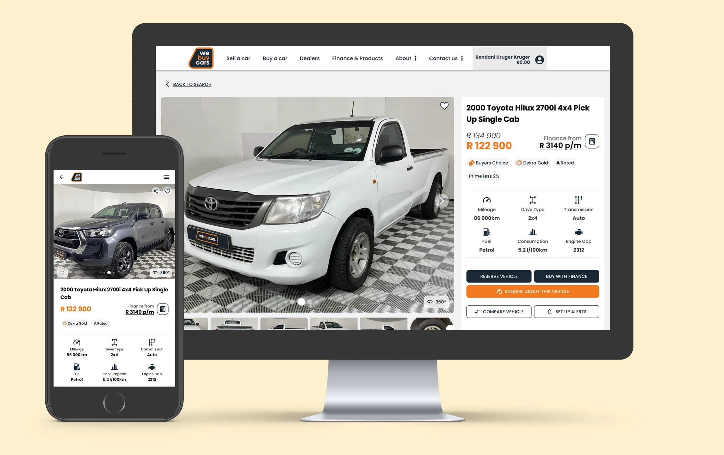
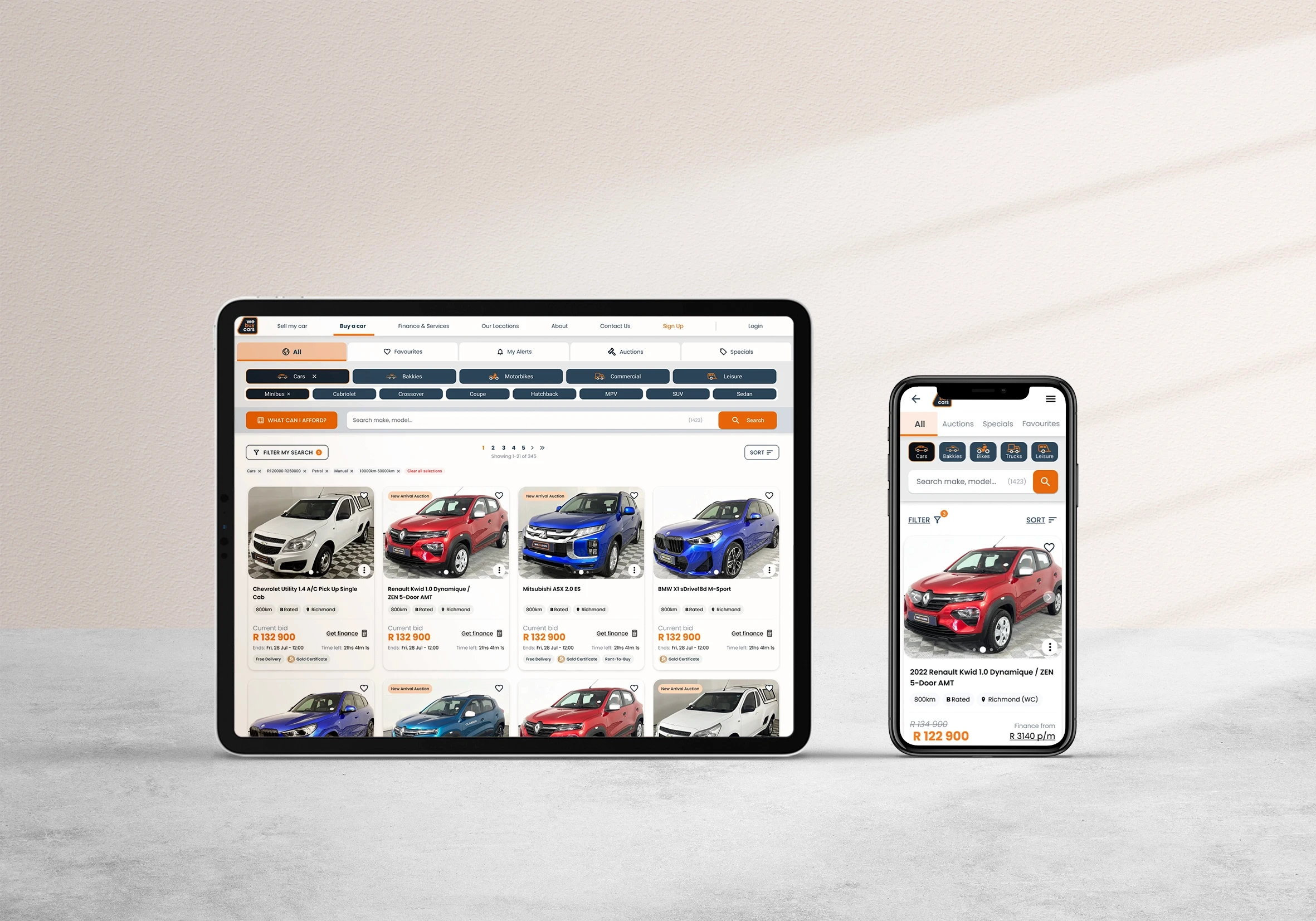
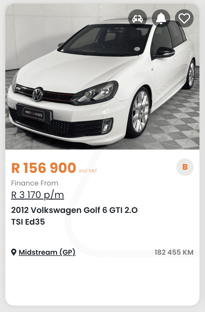
WeBuyCars - Listing
The original listings page required users to click into each vehicle to get basic information — slowing down comparison, increasing drop-offs, and creating friction early in the journey.
My Role and Conclusion
I started on the project by supporting improvements to the listings page. I was in charge of creating user tests for the vehilce card designs after the 1st iteration, while also being a part of the ideation and iteration process of this project. We as a team in MnR worked on improving the usability and clarity of the listings by surfacing more relevant details upfront, improving content hierarchy, and creating a more scannable card design. The goal was to help users compare vehicles at a glance, reduce unnecessary clicks, and build momentum toward conversion.
View the Website:
Finding the Problem
Due to the lack of analytics and KPI's to measure, we started off by creating a user test in Useberry as well as in person guerilla tests at the WBC Midrand Warehouse to gain some measurable metrics to aim for, we identified 3 problems


Main Problem Areas
Long time to find info
Users took an average of 25 seconds within a card to find the mileage
Users did not understand what the finance price was,
Users had a hard time understanding the compare function
Minor Problems
Hierarchy
Unclear hierarchy within the card having the location more important than the cars information
Users need more key info in listings to compare cars without opening each one
Various Iterations

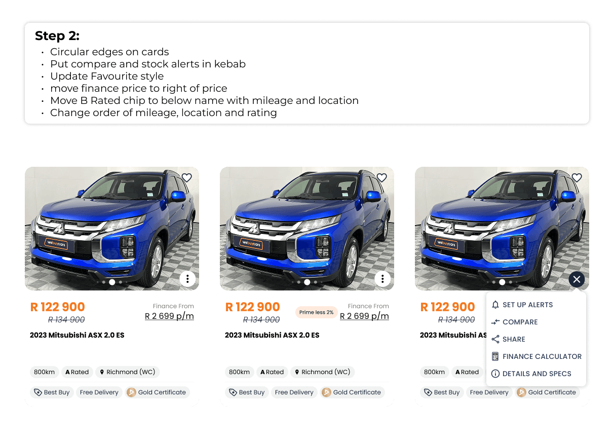

User Tests
We continously tested and reiterated our designs through various user tests with both Useberry and in person guerilla tests

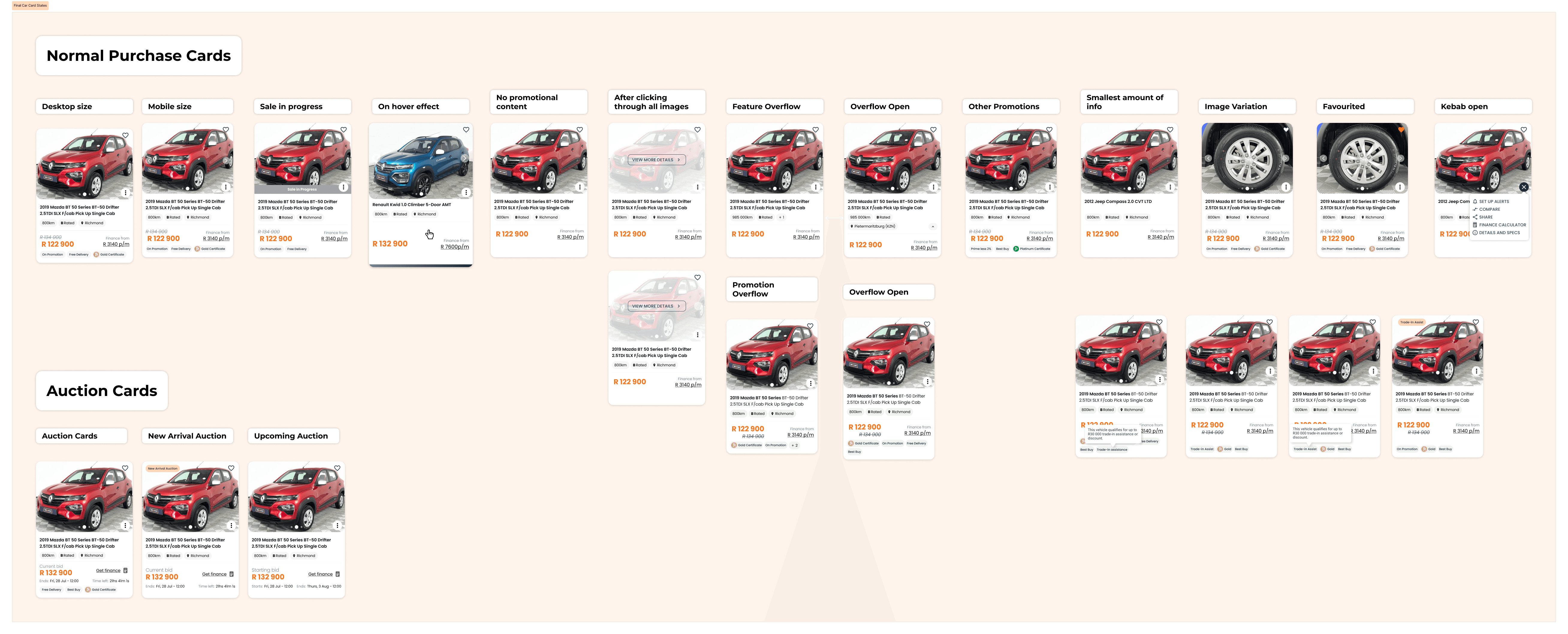
Final Mockup

Developer Hand Off
We worked closely with the developers and business analysts regarding the limitations and possibilities of our solution and smoothly took it to prod. We continously kept in touch to answer any questions that needed to answered
Finalised all states and variations of the card after final discussion with stakeholders
Outcome:
Reduced time taken to scan info with an average of 12 seconds (half the original)
Added more identifiers within the card without increasing card space
Challenges and Resolution
No analytics or KPIs:
WeBuyCars lacked user data and KPIs, making it difficult to measure performance or define success.
To overcome this, we ran our own usability tests using Useberry and in-person sessions, which informed our design decisions.
Our team pushed for proper analytics, and we're proud that Snowplow is now in place—providing valuable insights and a strong foundation for future projects.
Unclear categories
One key issue was the lack of clarity around fixed categories and ratings, like DEKRA levels and financibility grades (A or B), which couldn’t be altered. We addressed this by adding microcopy and tooltips to help users understand these terms more easily.
VIEW PROJECTS