My Role
Main product designer
User Research
Prototype
Design System
Team Members
5 Product Designers
Developers
Project Manager
Timeline
2023/24 - 4 months
WeBuyCars - Details
WeBuyCars was receiving a high volume of customer enquiries and complaints related to vehicle information and ease of use — even though the details were technically available on the site.
Users struggled to find or trust the information presented on the vehicle detail pages. Many felt overwhelmed by the layout, unsure of what to focus on, or uncertain about the vehicle’s actual condition and features.
The business team also reported significant drop-off rates on the website’s buy pages, pointing to a disconnect between user intent and how information was being delivered. It became clear that the issue wasn’t a lack of information — it was how that information was displayed and prioritized.
My Role and Conclusion
I was the main product designer tasked with the redesign of the vehicle detail page (VDP). By making the content clearer, adding visual cues, and improving how users were greeted when etnering the page, we reduced drop-offs, cut down support queries, and helped buyers feel more confident.
View the Website:
Finding the Problem
Due to the lack of analytics and KPI's to measure, we started off by creating a user test in Useberry to gain some insights
Old Designs

Main Problem Areas
Unclear Hierarchy
Due to the usage of contrasting bright and dark colors users usually lost focus
Users were very confused with the copy we used such as "specification" or "details"
Users had a hard time quickly finding the information they needed
Identifying functions
Users did not even look through the helpful links thinking it was superflouos info.
Users were confused between the dropdown and buttons
Ideating
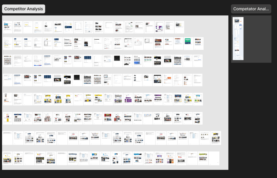
The team researched various competitors from carvago to carfax and identified various features and design that could be constitued as good ux
After all the team members went through the findings, All the product designers and analysts congregated and categorised all the necessary information needed within the detail page into distinct cateogories and clear titles

The categorisation was further validated through a card-sorting test on useberry with 3 groups of 10 users to understand the most recognisable patterns between each group as well as its sub- group

Iterations
After understanding the data we got from our workshops and user tests we started iterating our designs through multiple stages
Worked with all the other product designers to sketch their different iterations of designs they thought would work the best

Layout Wireframing and discussing with team
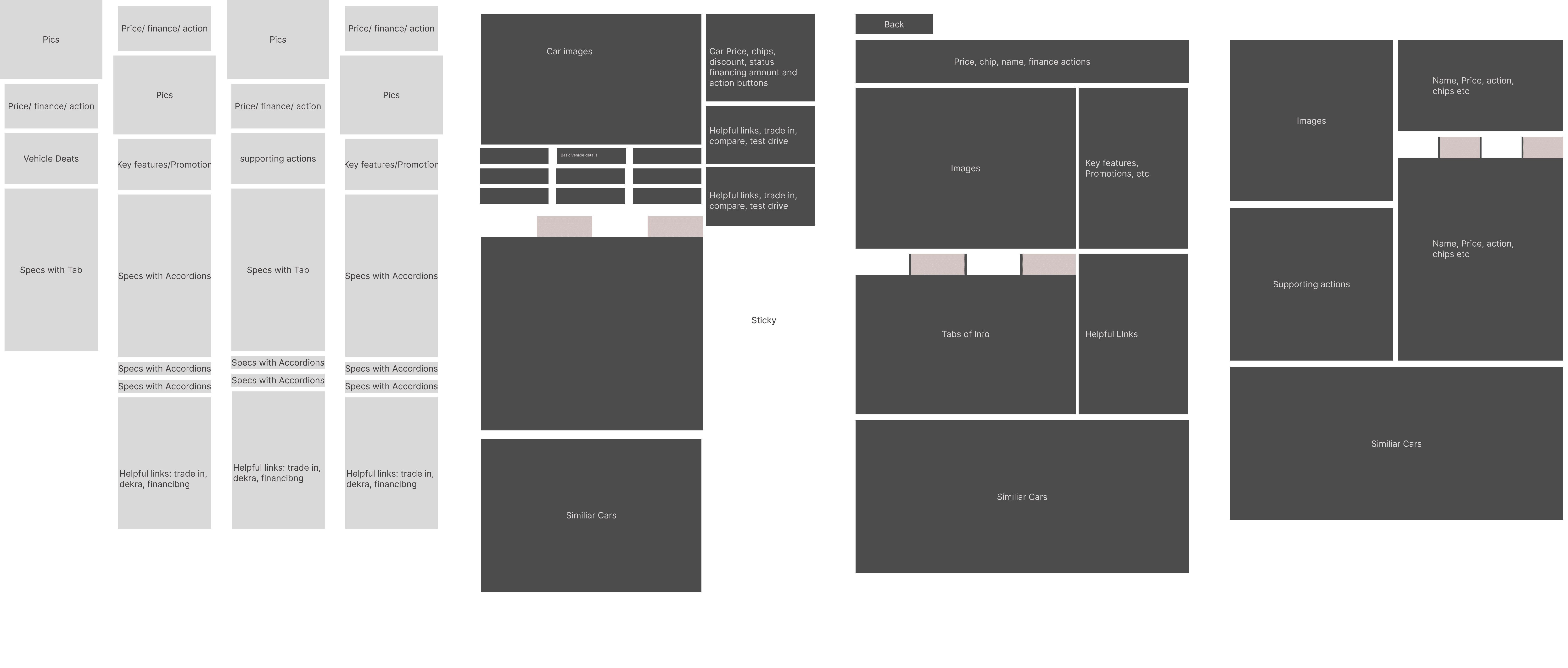
Final Variations to test


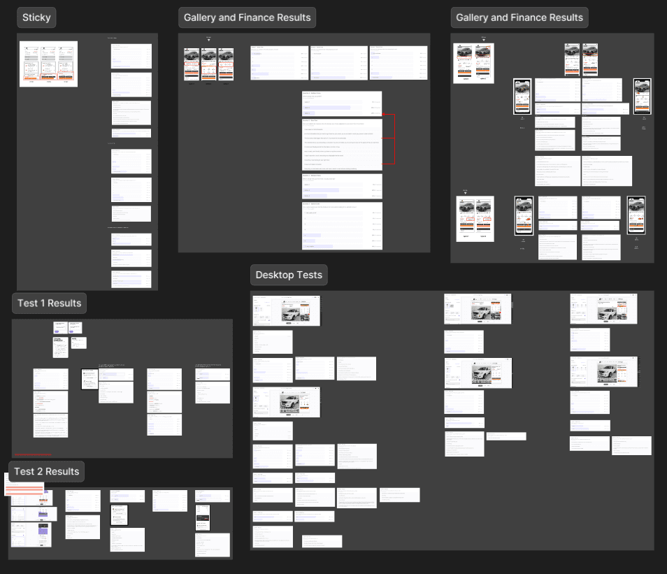
User Testing
I thoroughly tested each of these design variations ranging from the placement of information to the visual design of the elements and slowly iterated through out the designs
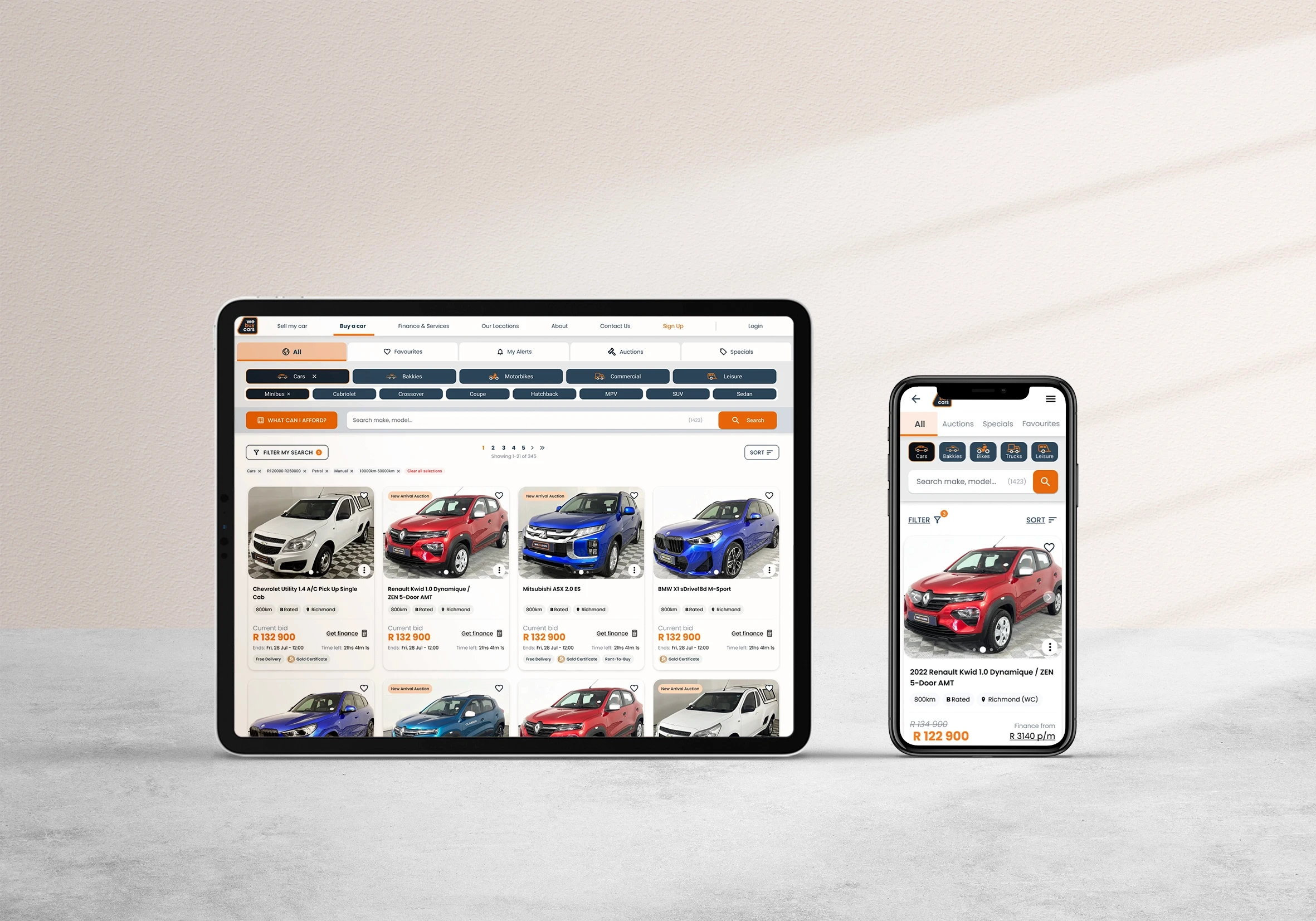
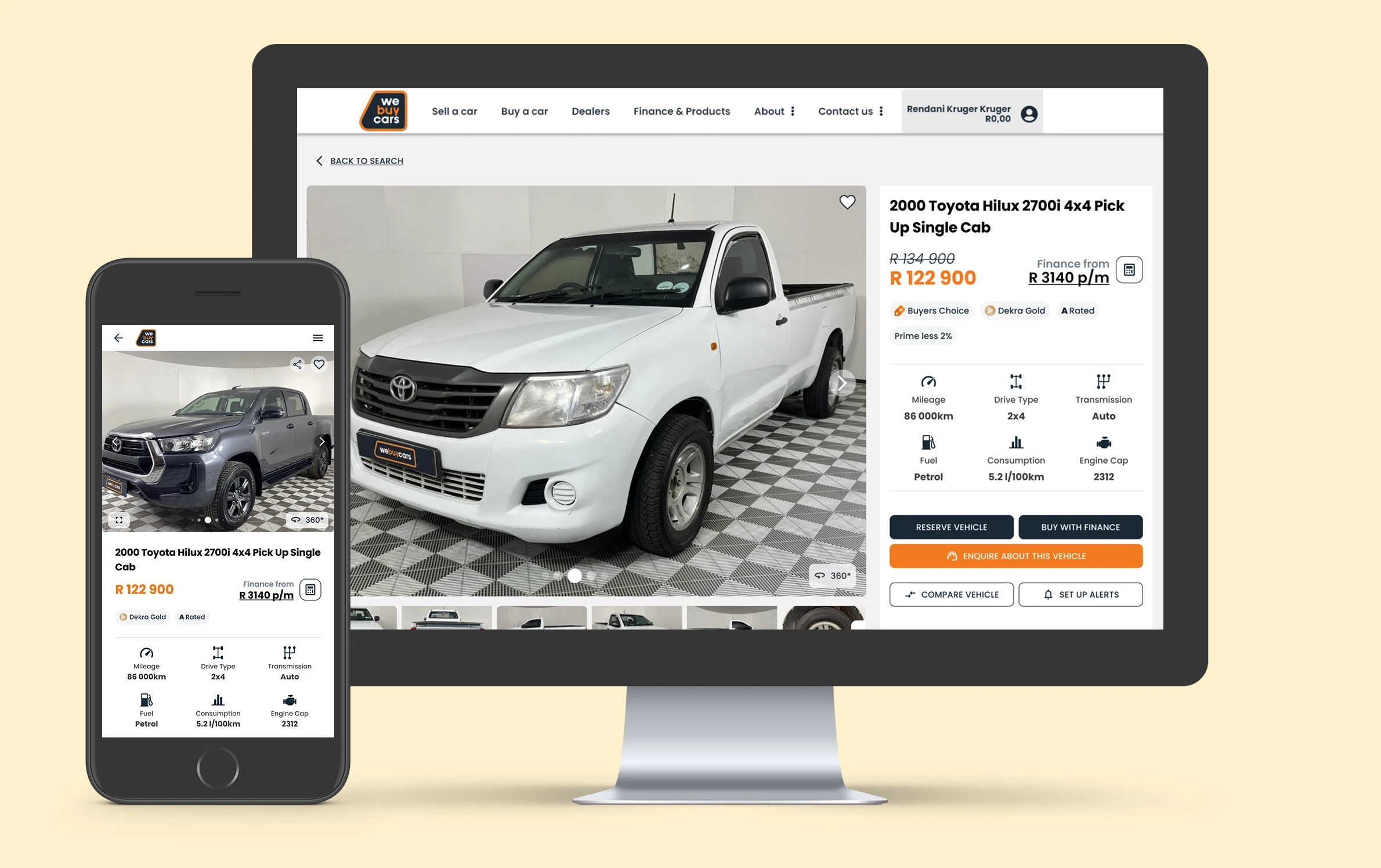
Final Designs
Mobile Designs with clear summary and hierarchical buttons, easily scannable details and buttons turn to sticky once past a certain threshold
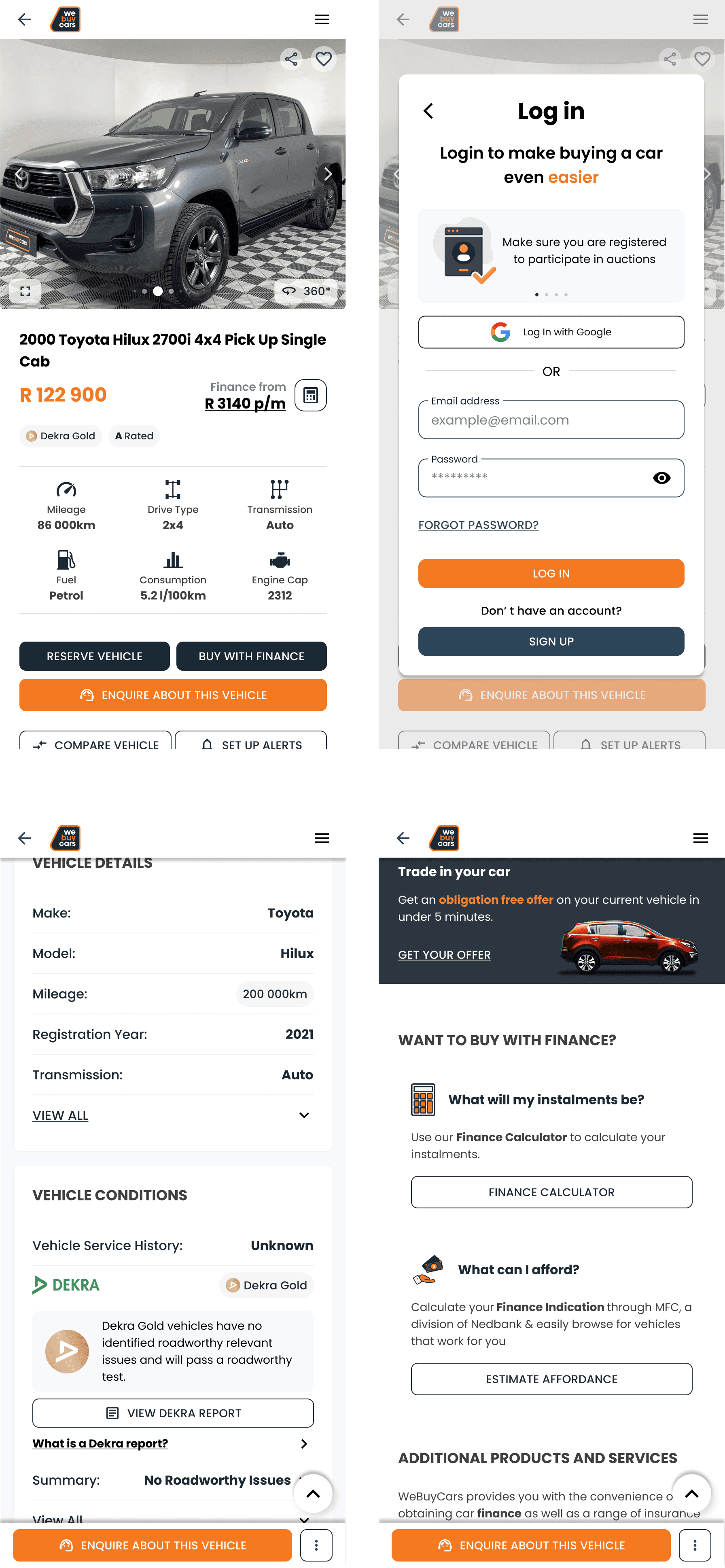
Desktop Designs with Sticky side bar with main functions, summary and finance information. Additonal information clearly categorised into intuitive groupings that is easily scannable

Design Handover
Annotation for variations and flows for Regular Vehicle Purchase

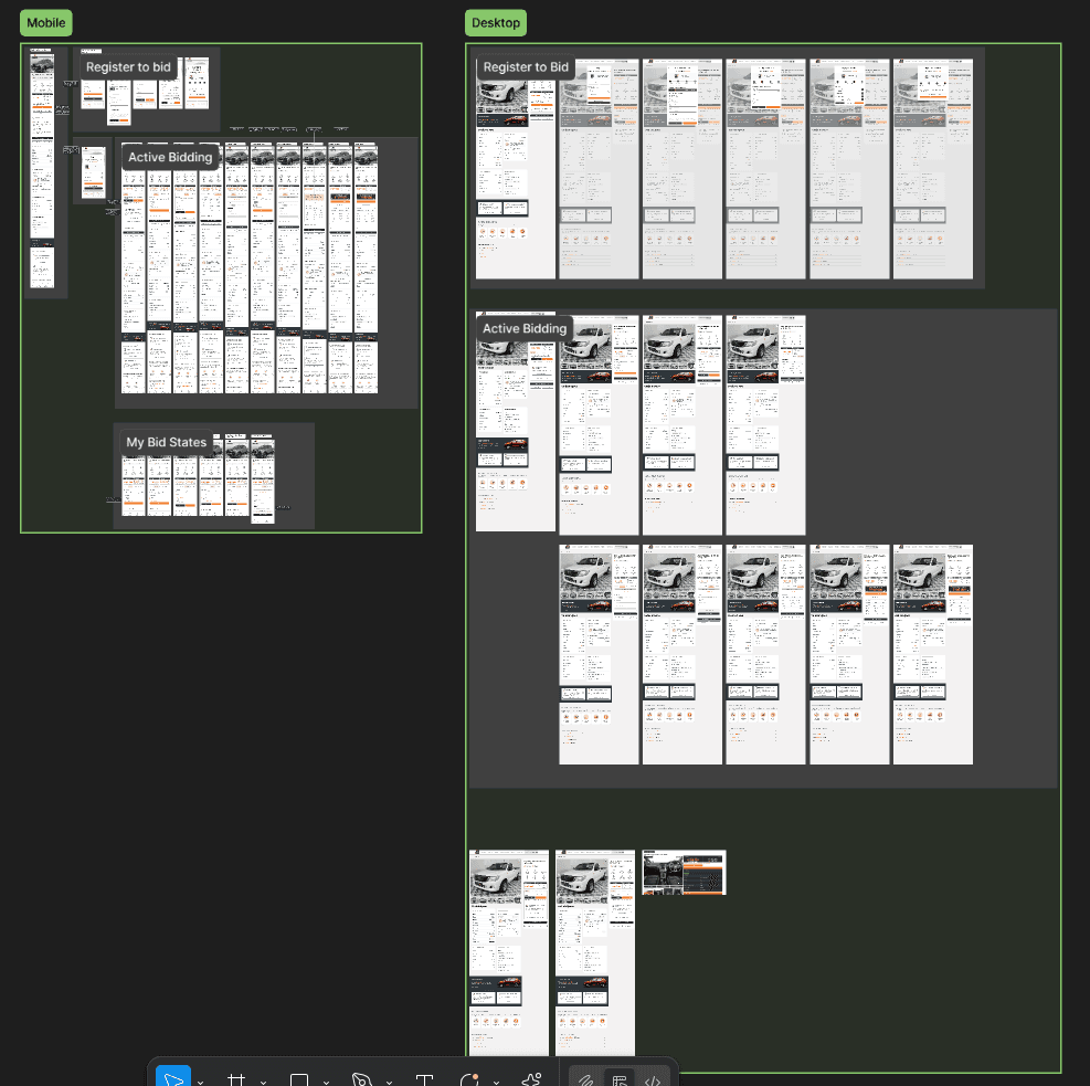
Annotations for variations and flows for Auction Vehicles
Outcome:
Clear hierarchy usage validated by high usability rating from user tests
Clear categorisation of car details made users find the detail needed within 47 seconds of visiting the page
Incorporated consistent and muted UI designs while using spot color sparingly
Clear indicators of helpful functions and features
Defined clear patterns and components which ensured clarity and consistency
Challenges and Resolution
No analytics or KPIs:
WeBuyCars lacked user data and KPIs, making it difficult to measure performance or define success.
To overcome this, we ran our own usability tests using Useberry which informed our design decisions.
Our team pushed for proper analytics, and we're proud that Snowplow is now in place—providing valuable insights and a strong foundation for future projects.
Categorising car details
Vehicle data often overlaps and lacks standardization, making it difficult to group in a way that’s intuitive for users. We resolved this by running targeted card sorting exercises on Useberry, which helped clarify mental models and define a structure aligned with user expectations.
VIEW PROJECTS